I wish I had an awesome intro for this. I was mostly excited to write this entry… though, the techniques are fairly well known. I totally have no problem repeating good techniques, because… you are going to forget you read it in some other blog 2 years ago anyway  But as I got into creating the sample pbix file… things didn’t really go that well. Pretty sure we are hitting some bugs in Power BI (yes, I have reported them!)… but we can mostly work around them. Mostly.
Anyway, Segmentation, Categorization, ABC Analysis… whatever you want to call it… these can be a really powerful way of looking at your data. Maybe you want to break out your sales by “Top 15%”, “Bottom 15” and “The Big Middle”. Or maybe you want too look at “Sales under $100”, “Sales under $1000” and “More”. Whatever it is… you have decided to segment your data.
Intro
Before digging in, let’s get something out of the way early… You need this segmentation to live in a calculated column… not a measure (or calculated field or whatever you like to call it). The reason is that you are very likely to want to put this on a slicer or the axis of your chart… so that you can see the breakout. You can’t do that with a measure! See what Ron Weasley has to say on the subject here: http://tinylizard.com/calculated-fields-vs-calculated-columns/
Also note that Microsoft has released a custom visual at the usual place https://app.powerbi.com/visuals/ which depending on your needs might let you skip all this madness It would appear that the Histogram visual (at right) is able to break things out into buckets for you… magically and dynamically, and if that is all you need, try that out. Then let me know how well it works.
Get Some Data
Here in the states, the NBA Championship tournament between the evil Cleveland Cavaliers and the heroic Golden State Warriors just ended in a sad defeat for the Warriors. With that fresh on my mind, I went out and grabbed some statistics from this espn site. Using the feature of Power BI that is not called Power Query made it super easy to pull in the data and do a bit of cleanup. Player, Team, Games Played, 3 pointers made and attempted, 2 pointers attempted and made.

I’m going to be a lazy a bit… and not show the creation of a calculated column “points per game” : PPG = (Stats[3PM] * 3 + Stats[2PM] * 2) / Stats[GP]
Setup Your Lookup Table


I really dig the new “Enter Data” button they recently added to the ribbon. It works just like you think it would… opens a dialog that has a grid to enter your data, and you can happily add rows/columns. I used this to setup my segments… the only way it is possible at all. Just kidding, I totally picked random segments… we are going to have 4 “buckets” of Point Per Game… loser butts that score less than 10 pts per game, all the way up to rock stars that score more than 20 per game.
I suppose I didn’t bother explaining why we are creating this lookup table. Let’s do that…
So, realize that you don’t “have to”. You could totally add a calculated column to your Stats table, that had something like:
= IF (Stats[PPG] < 10, “<10”, IF (Stats[PPG] < 15, “10-15”, IF (Stats[PPG] < 20, “15-20”, “>20” ))))))))))
I think I got enough right parens there? Anyway, that works, but as soon as you want to break this out into more buckets… maybe for every 4 point increment… well, nobody can type that many right parens! (Just kidding Power BI adds the right parens for you – total magic). Still, having a separate table obviously makes it much easier to change. And it’s quite nice that we can easily add the SortOrder column, so that our Description lays out in our visuals the way we want. What could possibly go wrong w/ this plan, he asks, in a way which implies foreshadowing…
Um, Okay, Now What?
Well. You probably want to create a relationship between your Stats table and this fancy new Lookup Table… but, well, sorry bub. You can’t do that. What exactly is Steph Curries completely ridiculous 25.5 points per game going to magically match up to in this relationship? Power Pivot and Power BI relationships are simply not that fancy – they do equality matches… and that’s it.
But somehow, we need to “stamp” each row in our Stats table with information from the lookup table… so, sounds like we get to write some fancy dax.Category = CALCULATE( VALUES(CategoryLookup[Description]), FILTER(CategoryLookup, Stats[PPG] >= CategoryLookup[Lower] && Stats[PPG] < CategoryLookup[Upper]))
Apparently I called my buckets “categories” and not “segments”. Whatever.
Our calculated column (which we are adding to the Stats table) says that for each row… “head over to the category table, and find the 1 row that my PPG is between the upper and lower limits, then return the Description”. And you can see it works super peachy keen, at left.
This worked great. But then… I went to create a visual and realized that my Category were sorting in a weird order.

Then I was like “Scott, what are you doing man? Put Description from your lookup table on the axis, since you already setup the SortOrder column!”. But then… I saw the chart at right. And I said “Oh ya, Scott. You don’t even have a relationship between these tables… that totally won’t work”. But then! I was like “Scott, you talk to yourself a lot, but … can’t you create the relationship now that you stamped the rows?”
That sounds like it should work. My stats table has a column (above left) of category (the many side of a relationship). My category lookup table has the same text, each showing up just once (the one side of my relationship). So, I excitedly created my relationship.
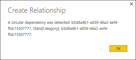
And like many of my past relationships… it failed quickly!
Now, I reached out to the Power BI team, and I was like “dudes. I used to do this all the time in Excel / Power Pivot, why did you break it”, but they seemed pretty skeptical. So, I worked up a repro in Excel… and it didn’t work there either. Weird.
But, if I changed my CALCULATE( ) to stop using VALUES( ) and instead use LASTNONBLANK (on the text description columns), or MIN/MAX (on the SortOrder which I secretly used as more of an Id column) – it worked totally fine in Excel. But it continued… not to work in Power BI. Pretty sure there was a regression here… I’m still following up w/ the Power BI team. 🙁
So… what does that mean?
Well, it’s not THAT big of a deal. Remember back when we were pretty happy, because each row of our Stats table was stamped w/ the correct category? You just use that. Now… you might want to fix the sort order, so… well, you need to make another calculated column:Category Sort = CALCULATE( VALUES(CategoryLookup[SortOrder]), FILTER(CategoryLookup, Stats[PPG] >= CategoryLookup[Lower] && Stats[PPG] < CategoryLookup[Upper]))
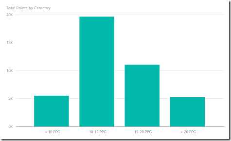
It looks almost identical to the other column except we grab the SortOrder column (instead of the description column). Then we can use the usual “Sort By Column” button to fix the sorting of our Category/description calculated column. Then, you can happily see that if you break out Total Points by Category… the super stars produce the least total points… of these totally arbitrary and near meaningless buckets, and that 10-15 points per game is where the real value comes from. Or… something.
LInk to sample: http://tinylizard.com/wp-content/uploads/2016/06/Segmentation.zip

- The streak is alive! – August 10, 2017
- DAX KEEPFILTERS Plus Bonus Complaining! – July 20, 2017
- VAR: The best thing to happen to DAX since CALCULATE() – July 11, 2017
- Review: Analyzing Data with Power BI and Power Pivot for Excel – June 20, 2017
- Power BI Date Table – June 2, 2017
Scott Senkeresty here… Founder and Owner of Tiny Lizard. Yes, I have done some stuff: A Master’s Degree in Computer Science from California Polytechnic State University in beautiful San Luis Obispo, California. Over twelve years developing software for Microsoft, across Office, Windows and Anti-Malware teams… Read More >>
You are hitting this problem: https://www.sqlbi.com/articles/understanding-circular-dependencies/
Just add an ALL ( table ) in you CALCULATE expression, where “table” is the table that contains the calculated column definition.
Edited my post to include the pbix file. I am… skeptical it is that easy. 🙂
Scott, sorry – did you change something in the text? I thought I read something about circular reference but now it’s no longer mentioned. Maybe I read your original post too fast? Thanks!
There is a circular reference (the post shows an error dialog)… but it’s not the usual “the 1st calc column is fine, but the same exact 2nd calc column gives a circular reference”. It’s something weirder 🙂 I have yet to find any way to create this relationship in Power BI… though… I have not exhausted my options yet 😉
Interesting – you cannot use VALUES but you can use MIN/MAX:
CategoryCode = CALCULATE ( MIN ( CategoryLookup[SortOrder] ), FILTER ( CategoryLookup, CategoryLookup[Lower] = Stats[PPG] ), ALL ( Stats ))
It should be investigated…
Scott, Marco, I posted on the technet forums about this about 6 months ago. The understanding I came to is it relates to the order in which the engine compiles JOINS and CALCULATE on load – it varies between versions of xVelocity.
The solution is to use MIN/MAX. Using calculate will always cause a circular dependency in PBI in this situation.
Have you tried this in PBI? Using MIN/MAX worked fine for me in XL, but… I failed in PBI.
Oops, I made an error, the solution is to use MINX/MAXX (if possible in your case 🙂 ) to create the key field and then join using it. Basically, avoid CALCULATE like the plague because the PBI is too smart for it’s own good – it is *kind of* correct in saying that there’s a circular reference.
I found my post:
https://social.msdn.microsoft.com/Forums/sqlserver/en-US/050b7f00-8938-4f6a-8682-90c12670851b/circular-reference?forum=sqlkjpowerpivotforexcel
Here were my findings:
Solution 1: Import the lookup table twice and perform the CALCULATE on that.
Solution 2: Perform the calculations in Power Query.
Solution 3 (the one I adopted):
Use a function that won’t rely on the join to calculate itself:
=MINX (
FILTER (
Lookup_Table,
Lookup_Table[Previous_Period_End_Date] = Fact_Table[Daily_Date] &&
Lookup_Table[Store_ID] = Fact_Table[Store_ID]
),
Lookup_Table[Period_End_Date]
)